We’ve something VERY different to show you today…
‘The Wylde Ones’ marks the beginning of a different strategy for Otherwurlde Studio.
As you probably know, since 2019 we’ve been selling both Fine-Art Prints & Original Artworks at the Corn Hall, in Cirencester. These weekend shows have been an invaluable opportunity for Ann & I to experiment with new ideas. Between us, we’ve tried all sorts of things–some of which have stayed the course, such as Otherwurlde itself…. Others, have enjoyed the life-span of a mayfly!
In recent months though, we’ve had to pivot a little harder. Since the summer of 2024, we’ve noticed a change of sentiment in the overall market, not just in the Corn Hall. To cap it all, Ann endured a nasty dose of bronchitis at the end of 2024, which left us both in a reflective mood…
So, during our break from the Craft Fair at the beginning of 2025, we began something new. Wholly new.
A project that would broaden our appeal and put us in front of a different audience…
The collection that we came up with?
So, what is The Wylde Ones?
In short, it’s a new collection of British Wildlife, that builds on lessons learnt and remixes them into something fresh. When you scroll down and see the work, we think you’ll agree.
“But wait!” I hear you cry: “What of Otherwurlde?” Fear not… Things will carry on much as before and new artworks will arrive as-planned. Instead, we prefer to see ‘Wylde, as the battery that will keep the Otherwurlde torch shining and unlock a sustainable future for the studio. It’s as simple as that…
We’ve been working VERY hard on this–for months, now–so it’d be great to hear your feedback! Whether brickbats or bouquets, it would be useful to hear what you think, so please use the form HERE, once you’ve seen everything.
With our warmest wishes,
Gary & Ann


So here we are then. The Wylde Ones…
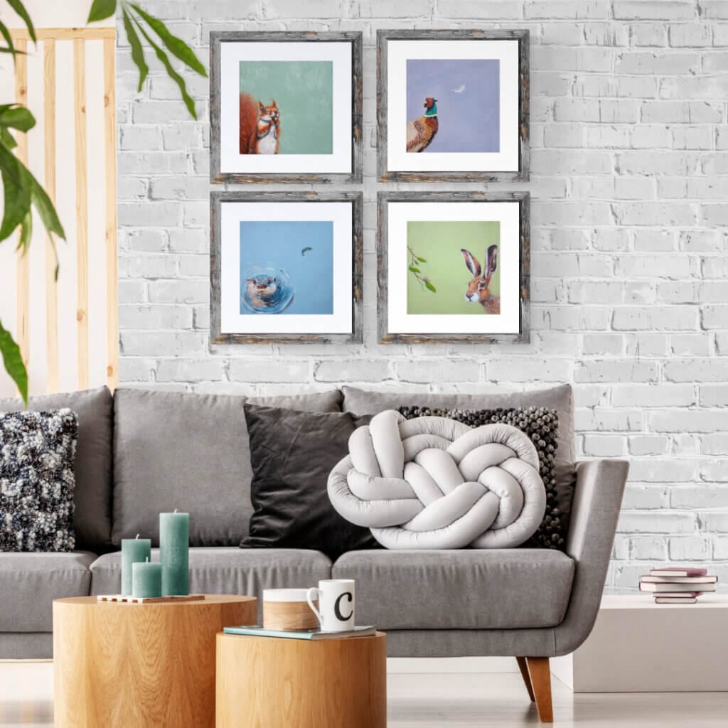
All hand-painted by Ann, on canvas-wrapped boards, there are a couple of points we’d like to share at the outset.
First… the dramatic use of colour-blocking! One of the lessons learnt from Gary’s ‘Fauna‘ collection, was the appeal of having a bold slab of colour for a background. But whereas the hues found in digital work often delivered ‘brighter’ tones, we had to find something else: something warmer & more sympathetic, appealing to a different audience. Inspiration struck when we had the idea of matching these colours to the ‘Archive Collection’ of a well-known heritage paint brand we think of as ‘Barrow & Fall’.
We should stress at the outset, that we can’t use F&B’s B&F’s actual products. House paints don’t sit well with oils, thanks to their wildly different drying speeds & composition. So instead, Ann concocted mixing recipes for select hues, that enabled her to recreate them in oils… The results are quite remarkable. Having seen them side-by-side, you’d be hard-pressed to tell them apart!
Allied to the colour choice, is the decision to paint onto canvas, rather than the boards & panels used for Otherwurlde. At a stroke, the imperfections in the weave coupled with painterly smudges & nudges, lends real character to the pieces. These are paintings that breathe – that revel in their loose, almost-gestural feel.
Which brings me to the Second point…
With a notable exception, all the pieces in this collection place their subjects at the corners…
Why? Because first-and-foremost we want to think of these as the ‘wild’ animals they are. These are creatures who have just crept into view…
A happy accident this, for it focuses the eye; grabbing one’s attention and making the whole sing, almost as an abstract. Of course, that’s nothing new in the long history of art. But for a collection so focused on colour? We think it’s a critical step in making this idea work.
In addition, it allows room for ‘something else’ to appear in the composition; difficult to pull-off, if the main subject were front-and-centre. By tickling everyone’s ‘OCD’ tendencies and choosing the corners, we’re giving ourselves ‘room-to-manoeuvre’.
I think that’s enough detail for now: let’s have a look at our first Collection…

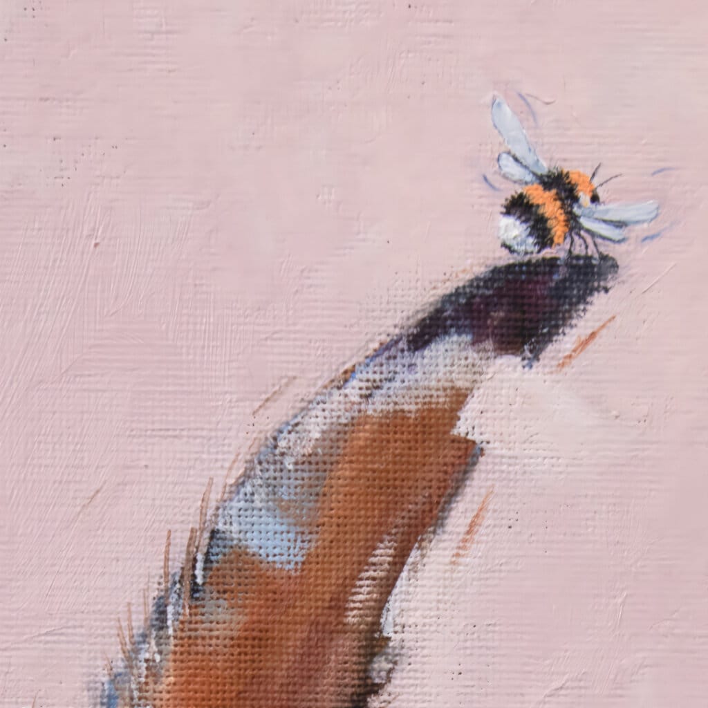
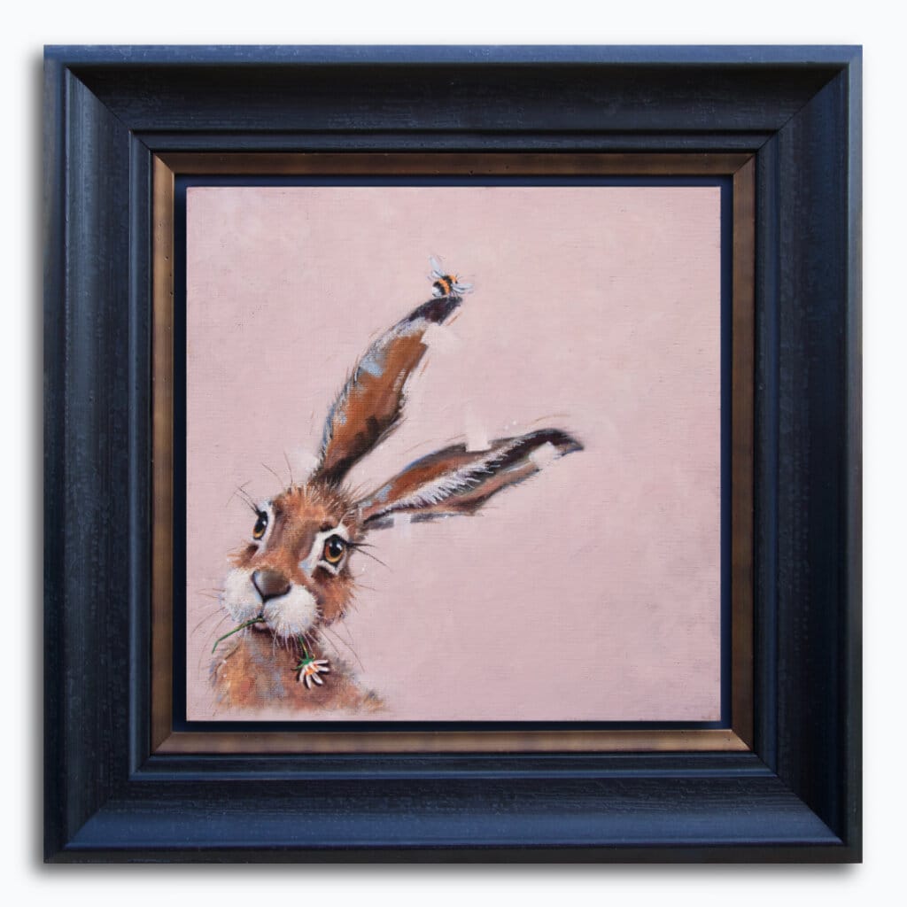
Introducing “Bee Hare Now…”. If a collection can be said to have a starting point, then for The Wylde Ones, it’s probably this. Bee Hare Now… emerged from an intense sketching session that Ann fell into in the first weeks of January, when her bronchitis kept her from finishing ‘Steady As We Go…’. Indeed, it was this very painting that set this whole, madcap idea into motion…
For Bee Hare Now… we went with ‘Pink Drab’ from the B&F Archive. After a few detours around the palette, in search of its recipe, this was the first hue that Ann found an identical match for.
This whimsical painting captures a loose, almost gesturally-painted hare in a quiet moment as it nibbles on a daisy. Look closer: a bumble bee is tickling one of its ears!

Ann is very pleased with the painterly touches she’s been able to find – and expand – for this collection: the ‘action lines’ running parallel to its ears. The squared-off palette-knife ‘nudges’ that edge into organic forms. The loose, expressive feel as the canvas weave punches through.
The image below, shows how we’re going to frame Original Artworks in this collection. Wherever we can, we’re going with float-mounting over a matte-black background, with a gently contoured moulding, again in matte-black. We consider this the ideal solution to best support these expressive slabs of colour and allow them to ‘sing’.

Next, we have ‘Feeling Nutty!’ Ann fell in love with its ecstatic look as it takes its first nibble of an acorn–I think she must’ve been pining for chocolate at the time! This piece emerged quickly after ‘Bee Hare Now…’, as we were trying to chase the energy that we’d found.
We chose ‘Chappell Green’ for the background. There’s a coolness about this hue, that bounces effortlessly off the squirrel’s warmth. That huge red-brown brush of a tail also does a great job of filling-out its corner.


With the first two pieces away, thoughts turned to something darker. Ann had found a charming reference photo of a rain-soaked Little Owl, scowling at the camera. It was a funny image, but to make a painting, it needed a lift from something else. That’s when we had the idea of perching it on a branch and having the raindrops fall, not direct from the sky, but from an overhanging leaf…
The butterfly was the finishing touch: there’s something in its attitude that suggests it feels smug; bemused that the owl hasn’t realised that all it has to do to escape the drip, drip, dripping, is to shuffle further along..!
For the colour, we chose ‘Serge’. This velvety-dark blue works so well in pushing the owl forward & giving strong contrast to the butterfly & leaf. In addition, on the original artwork, Ann’s layered painting reveals bands of lighting & texture, as if we really are looking at a band of squally rain…


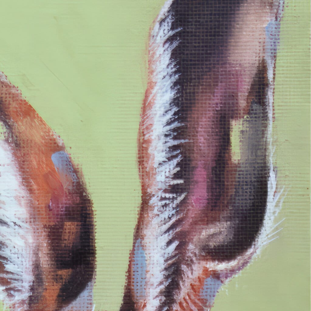
Now we arrive at painting #4 – ‘Berries for Badger…’. by this point, Ann was starting to find her groove. The motifs that we’d been playing with, were beginning to form part of the image from the outset, rather than be added ‘after the fact’. So that prominent notch effect now appears in its chest hair… The vague, lumpy & uneven textures in both paint & canvas. Couple of things to note here: that beautiful eye and surrounding lids. The brown snout, against that smooth blue and the berries themselves: bright, punchy reds.
‘Belvedere Blue’ was the hue chosen for the background and we think it works so well here. There’s a meditative calmness about the piece that another shade just wouldn’t have given.


If we’re establishing a pattern in our compositions, then ‘Three Thieves’ is the ONLY one to break the mould in the collection that emerged. Why? Because not only do we have three subjects, as opposed to just one… But we then have them forming a line between corners, rather than suggesting one.
But we didn’t care, as the idea of this trio of Harvest Mice working together to steal the berry, like trapeze artists, is so appealing – so delicious – that, like them, we couldn’t let go: so here it is!
The background colour was always going to be vital for this one: too pale and the mice’s golden colours might be washed-out. Too dark and the whole thing is suddenly unreadable. In the end, we went with ‘Mere Green’ and we couldn’t be happier with the result.
We had to have a Fox. Had to…
But Ann’s painted them before and it’s hard to find a fresh look in an old friend!
Then one of us had the idea of it holding a dandelion clock up to the breeze and watching transfixed, as the seeds fly away. In a flash, we had a beautiful, soulful and downright magical piece that just works.
But it’s time for a confession. Just as ‘Three Thieves’ broke a rule, so does ‘Clock Watcher…’ For nowhere in the B&F Archive, could we find the ‘right’ violet-pink that we needed to make this work. Not even anything close. So Ann took the recipes learnt to that point and found this beautiful, almost shimmering hue that we’re calling ‘Ramsbury Violet’!
It’s the only shade we found ourselves in this initial collection, but having lived with it for some weeks now, we still can’t find another that suits the subject this well…!

Just as we needed a Fox, we also felt we needed a deer – specifically a Red Deer Doe…
Again, how to present it? Then we thought back to ‘Bee Hare Now…’ and got our answer. But rather than use a bee, we thought: Dragonflies! From there, we took a step forward and used a pair of dragonflies, zipping about the ear. Simple but oh, so graceful.

We are both thrilled at how this one came out: from the delicate mauve-purple on its upper nose, to the gentle peach-tones in its ear, this Doe is doing a lot of things right. And those huge lashes, shielding liquid brown eyes. Yes!
That warm colour-block for the background is an almost Indian-inspired hue called ‘Orangery’ and its become the perfect choice for the subject.


Drive the rural backroads in the part of rural North Wiltshire where we live, as in the Cotswolds next door, and you’ll likely see a Pheasant darting into the hedgerow. Maybe you’ll even be unlucky enough to run one over with your car, as I did the other day…
Whatever your feelings on them, if you stop and just look at the birds – at the Cock Pheasants, in particular – you’ll be dazzled by the iridescent shock of blues & greens about their necks. The rich toffee-brown shades of their outer plumage and those unmistakable crimson wattles. They really are beautiful game birds, worthy of a second look.
What makes this painting sing for me though, is the sight of that feather, innocently wafting its way to earth… What unfortunate event has caused it to float free?
We’ll leave you to work that one out and tell you instead, of the colour used: ‘Skylight‘. A subtle shade of mauve, its hint of warmth complements the bird’s own rich tones and gives contrast to the white feather.

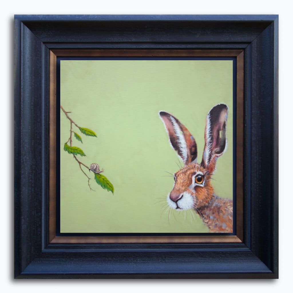
We were feeling confident that we’d found something fresh. So it was time to push things a little, with another Hare… Could we find another idea as compelling as the first?
Ann chose this wonderfully expressive ‘Saxon Green’ for the backdrop. It works so well, to counterpoint the hare’s gingery fur. Sitting on the leaf opposite, is a snail (that Ann’s very pleased with!) and the hare’s expression makes me think that its just encountered something that – to a hare – barely looks as if it’s moving at all!
Some lovely textures & marks in its ears, too. Those pink dashes and blue-green smudges are the perfect touch, I feel.


‘Faster Food’ was one of those paintings that came together in what felt like the blink of an eye..!
We knew the collection needed an Otter in there somewhere, but how to do it? The answer came almost without thought: by looking down onto its head, we could show spreading ripples on a blue background: Yes! And what could it be looking at–YES!–Lunch, as it unexpectedly skips away..!
‘Yonder’ was the hue we chose for here and it works so well. There’s a chalkiness there, that blends effortlessly with the reflections in the ripples. A lightness of touch, that’s become an emerging hallmark of this collection.

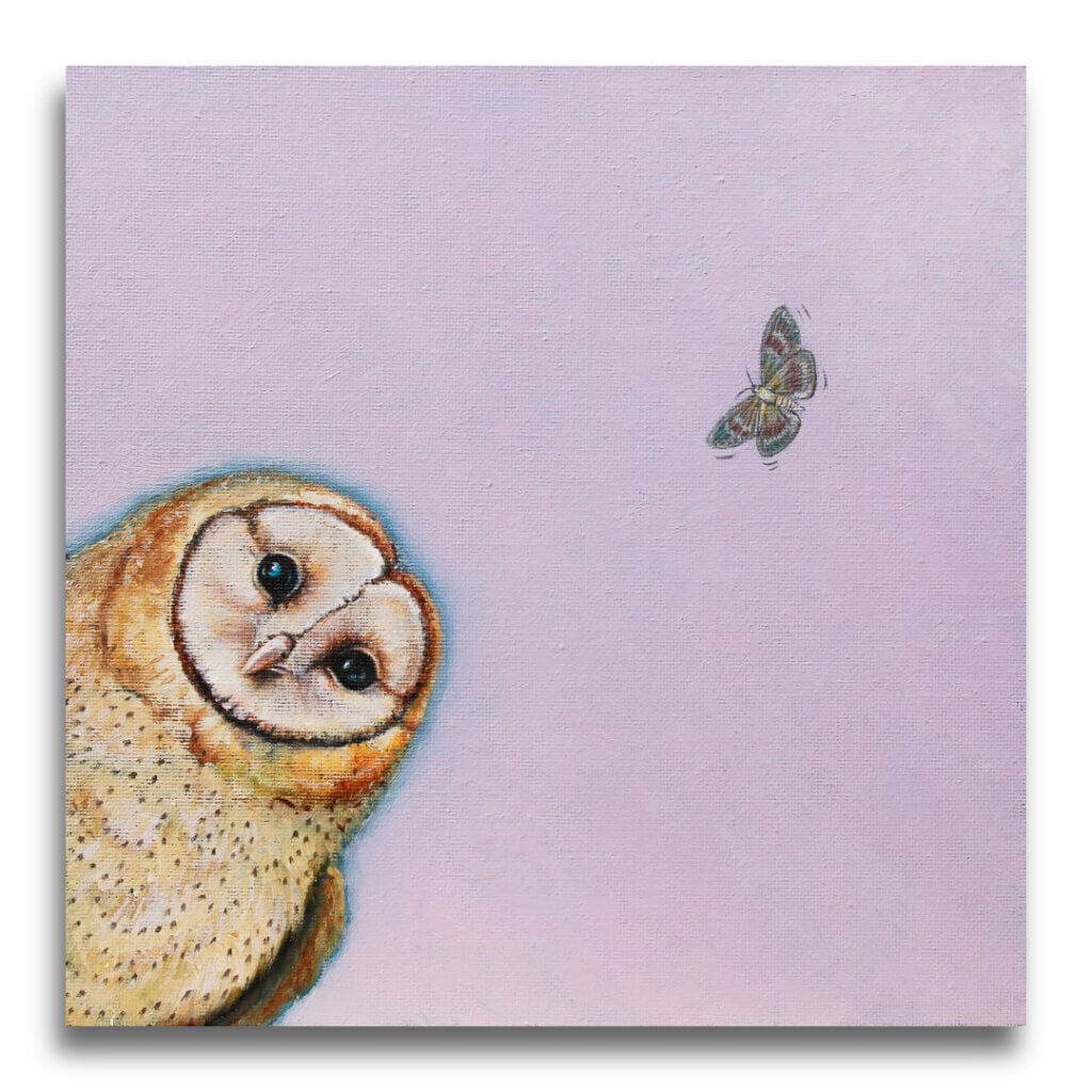
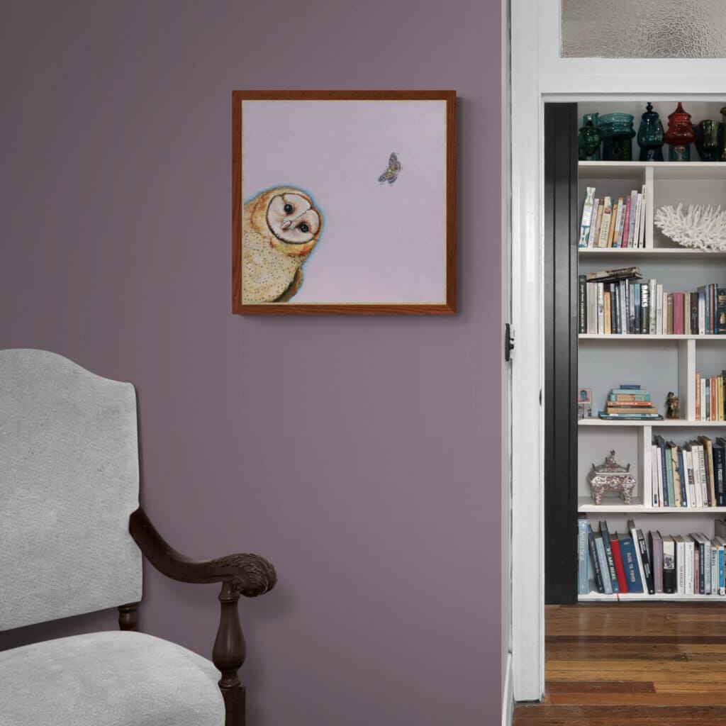
With ‘Feathers…’ behind us, we felt sure that we could include other birds in the collection and a Barn Owl seemed an obvious choice, given that we often see them as we drive back from Cirencester; there’s a particular gate that we pass, where a Barnie frequently ventures out from the nearby Dutch Barn to perch and hunt…
In common with all the creatures in The Wylde Ones, these magnificent birds live all around us. We just have to put ourselves in places where we spot them…
‘Folly Pink’ was our background choice here. There’s a dusky feel to this peach-hue that both of us found appealing; the idea that the time to fly has arrived. That red tiger moth, up in the top corner, is a perfect, subtle counterpoint to the owl’s turning gaze.

As the last-but-not-least entrant in this initial batch of artworks, we present ‘Core Confusion…’! This utterly charming little Hedgehog is sniffing the air above this rosy-red windfall: is there something meatier on the air? The little green worm that’s poking out might want to hide–and fast!
We used the ‘B&F’ classic ‘Smoked Trout’ for this one. That pale, desaturated pink / mushroom brown blend works well here, to show-off the Hedgie’s underside; a view we seldom see in artworks featuring this treasured garden friend.


The image below, shows how we’re going to frame Original Artworks in this collection. Wherever we can, we’re going with float-mounting over a matte-black background, with a gently contoured moulding, again in matte-black. We consider this the ideal solution to best support these expressive slabs of colour and allow them to ‘sing’.
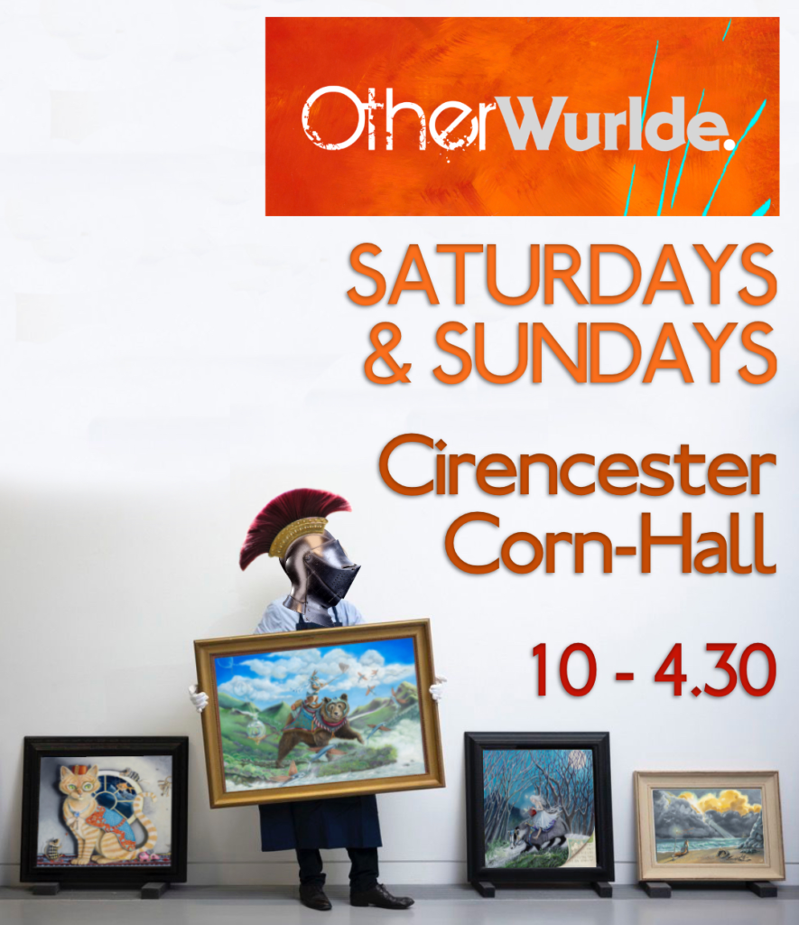
We’re back at the Corn Hall, Cirencester EVERY weekend (Saturdays and Sundays) until the end of June. That’s because throughout July, we’ll be welcoming you to our home-studio as part of Marlborough Open Studios…
Our stand at the Corn Hall might look impressive these days, but we still struggle for storage. That means we can’t bring everything you might want to see…
Neither Ann nor myself want to disappoint you, so if there’s anything you’d particularly like to see in-person, PLEASE get in-touch ahead of time and we’ll ensure it’s there!
Thanks for getting to the end of this Newsletter!
Well there we are: The Wylde Ones are now out-and-about in the world!
We hope that you’re as thrilled by these as we are… It’s been a long time since Ann has painted ‘wildlife’ but it’s something we always knew we’d return to eventually. But whatever direction we chose, it had to be right… At the risk of repeating myself, the Otherwurlde project is here to stay, so whatever we came up with, had to be a ‘copy of nothing’. I think we achieved that..?!
Because these paintings are a lot smaller than a typical Otherwurlde artwork, you can expect more frequent updates from us. Our aim is to release a second batch of six more pieces fairly soon, after which it’s back to Otherwurlde. That should be enough for a while!
I think we’re going to end up alternating releases between the two collections, so whichever you’re drawn to, I’d ask that you ‘keep the faith’. Lastly, I can’t close without offering our thanks to you all. Your support (and patience) has been immense over the few years we’ve been on this ride together; we couldn’t do this without you: let’s keep this light burning, shall we?