Ann & I are thrilled to reveal the second half of our new Wylde Ones collection for you today…
For a new collection that only launched six weeks ago, we couldn’t be happier with the reception that Wylde has received. Every weekend, our stand within Cirencester’s Corn Hall welcomes new collectors into the fold and we’re seeing a gradual increase in online orders as people expand their displays. We’ve also sold close to half of all the Original Artworks, which is amazing! Is your favourite still available?
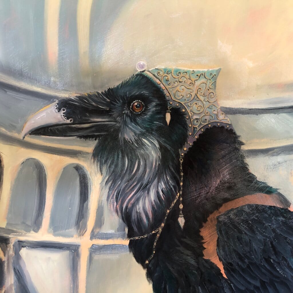
You will recall from last time, that our aim was to create ‘a battery to keep the Otherwurlde light shining’? Well, I’m pleased (and a little relieved) to report that Ann has embarked on our next full-size Otherwurlde piece in full-confidence: in time-honoured fashion, I’ve put a sneak-peak at the very end of this Newsletter!
Finally, a quick reminder that July sees our annual Open Studios programme. Every weekend throughout the month, our home studio welcomes casual visitors & long-standing collectors as part of the ‘Marlborough Open Studio’ festival. Every year, we’re amazed at the enthusiasm shown for the work and we’re hoping this year will prove no exception! In previous years, we’ve left the Corn Hall for the whole month, but we’ve decided to attempt BOTH in 2025…
So… I shall be running the stand and ONLY showcasing Wylde Ones, leaving Ann to hold the fort here, with an emphasis on Otherwurlde. We might have a small display here for ‘Wylde’, but that’ll be all.
I will be back with a bigger update before July, but that’s the plan!
With our warmest wishes,
Gary & Ann

So here we are again… The Wylde Ones (Part TWO).
For those who’ve been following from the start, welcome back. And if this is your first glimpse into The Wylde Ones, don’t worry—we’ll get you up to speed.
Each piece in this series has been hand-painted by Ann on canvas-wrapped boards, and there are a couple of points worth highlighting again as we reveal the second half of the collection.
First—colour.
One of the key discoveries from Gary’s earlier Fauna series was the impact of bold, clean colour-blocking. With Wylde, we wanted to go further—retaining that clarity of form, but softening the palette to feel warmer, richer, and more sympathetic to a different kind of home-setting. That led us to the idea of matching our tones to the Archive Collection of a certain heritage paint brand—let’s call it Barrow & Fall.
We should be clear: we’re not using household paints: oils and emulsions don’t play well together! Instead, Ann reverse-engineered a handful of select hues, creating bespoke oil blends that evoke the original hues with uncanny precision. Seen side-by-side, you’d be hard-pressed to tell the difference.
Next—the surface.
Unlike the smooth boards most often used for Otherwurlde, these are painted on linen-wrapped canvas. That subtle weave—along with Ann’s deliberately gestural brushwork—lends the works both a softness and zest. These paintings breathe. They don’t aim for precision; they hum with intent.
Which brings us to the second distinctive trait of the collection…
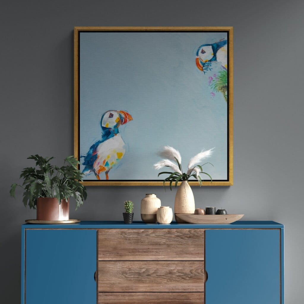
The subjects sit at the edges...
With one or two exceptions, these creatures are tucked into corners—as if they’ve just crept into view. It’s a quiet nod to the idea of wildness: not staged, not centred, not asking permission. The effect is visually arresting. By pulling the subject to the margins, the image often reads as an abstract first, an animal portrait second—and that duality matters.
Interestingly, this off-centre framing has stirred something unexpected in viewers: a quiet discomfort. We’ve had visitors who admire the work deeply, yet confess they couldn’t live with it on their wall—troubled by the unsettling asymmetry. That’s fine by us. In fact, it echoes a belief we hold dear: that art should provoke. It should challenge the eye, unsettle assumptions, resist complacency. It should spark thoughts, start conversations, and trigger the kind of personal coincidences that make a piece yours. Art should earn its place—not charm its way in by playing safe.
It also gives us the space to let other narrative elements emerge—things that would feel cramped if the subject was bang in the middle. There’s something deliciously mischievous about leaving room in the frame. It feels unfinished in the best possible way. Like anything could happen…
So, with that in mind… let’s take a look at what the second wave brings.
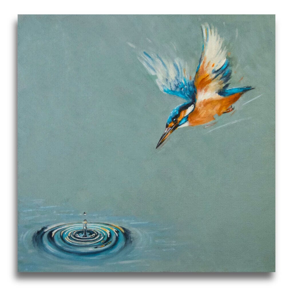
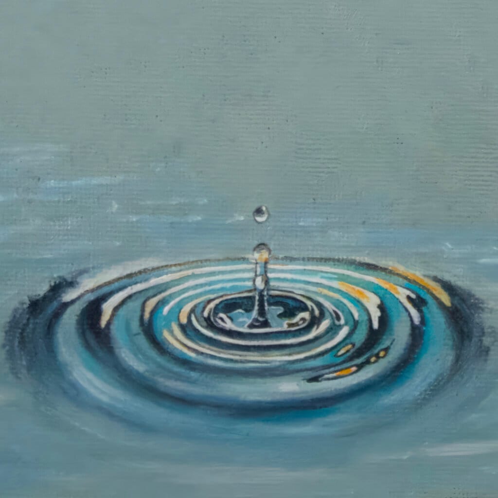
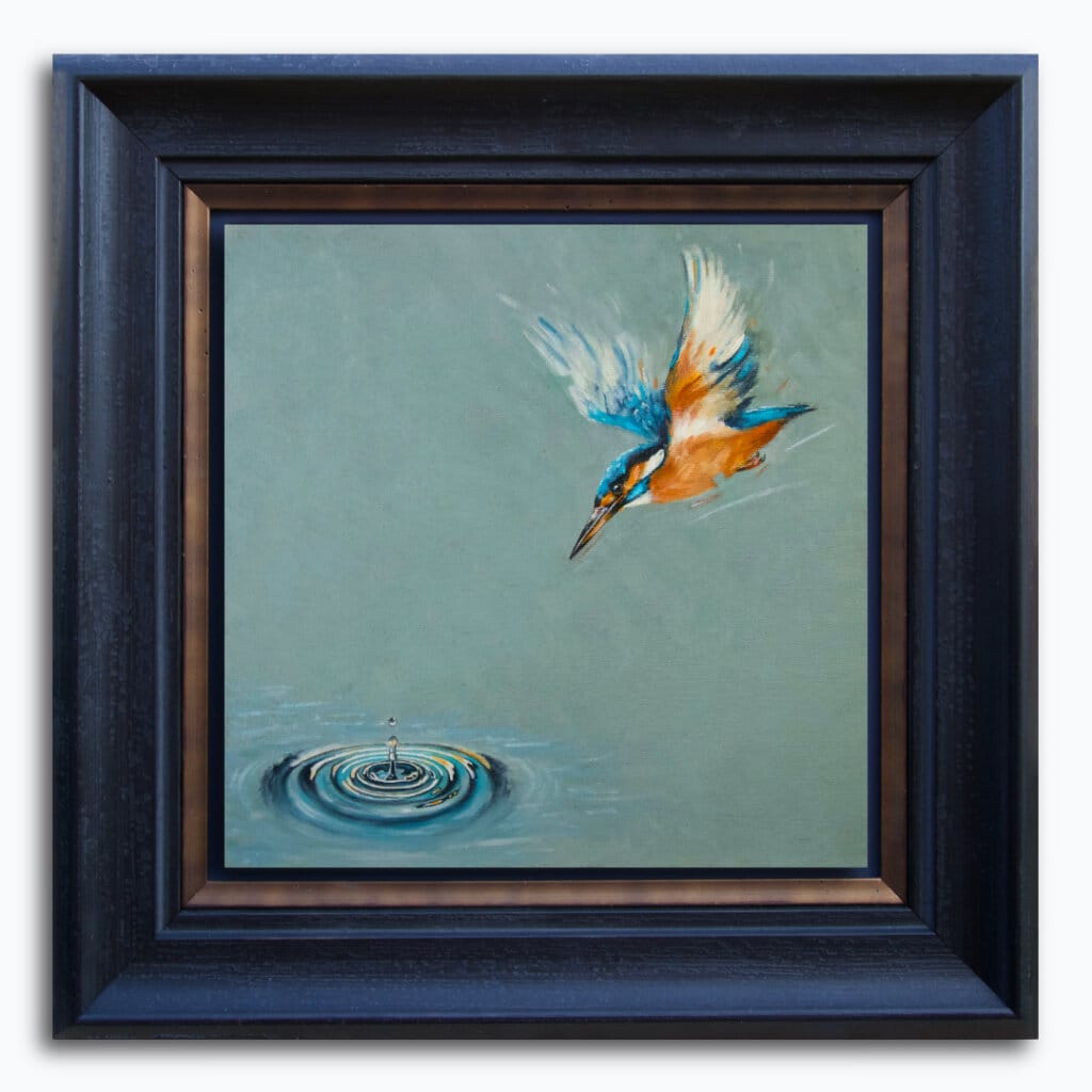
One of the most popular entries within the Otherwurlde Collection, is ‘A Bigger Fish?’
So… Planning for a Kingfisher to sit within the Wylde Ones was always on the cards. The only question to resolve, was just how to show one… In the end, it was a straightforward choice: If the Wylde Ones is about celebrating natural behaviour, in all its bewildering variety, then shouldn’t this Kingfisher be, err, fishing?? Exactly!
For The Fisher King… we went with ‘Castle Grey’ from the B&F Archive. This murky, mysterious blue-grey seemed the ideal counterpoint to the bird’s electric blue & orange plumage. Note, too, how Ann was able to add just the right amount of motion-blur into those wings… (And you get extra marks if you remember Gilliam’s film!).
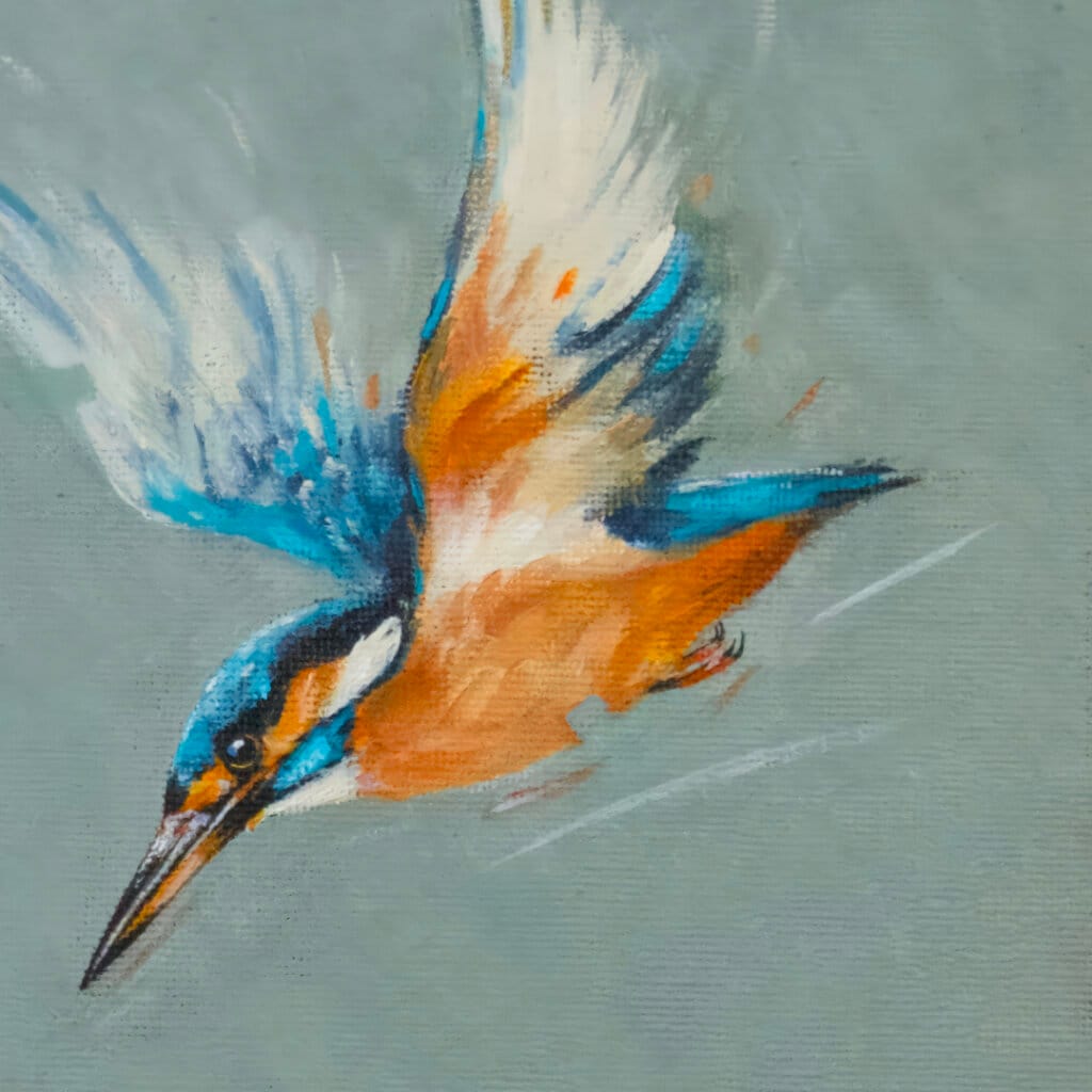
Ann is very pleased with the painterly touches she’s been able to find – and expand – for this collection: for example, the ‘action lines’ running parallel to the bird’s wings. The squared-off palette-knife ‘nudges’ that edge into organic forms. The loose, expressive feel as the canvas weave punches through.
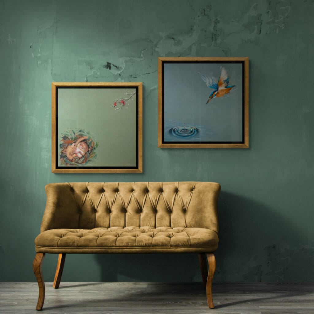
The image below, shows how we’re framing Original Artworks for this collection. We’re having work float-mounted over a matte background of midnight blue. There’s then a small gap before we get to a fillet of distressed & antique’d effect brass. That allows the blue backboard to show through along with the natural shadows cast by the artwork itself. It’s a beautiful solution. As for the actual moulding, we’re using a gently contoured, inward-sloping moulding in matte-black. We consider this the ideal solution to best support these expressive slabs of colour and allow them to ‘sing’.
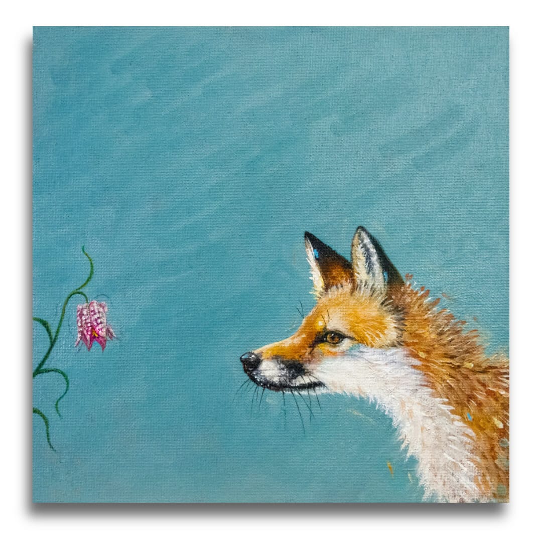
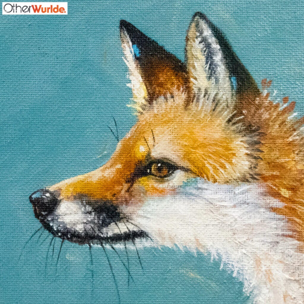
Next, we have The Fox and the Fritillary. A few years ago now, we were fortunate in being selected to supply a wide variety of artworks to a hotel in nearby Cricklade (big shout out to Derek!). Until we started the job, neither of us knew that Cricklade’s renowned for the numbers of Snakes Head Fritillaries that grow in the fields surrounding the town. This beautiful, striking flower can be seen throughout the UK, of course, but for some reason, the epicentre is Cricklade: who knew?
We were always going to have a second fox in the collection, so having a young cub encounter its first fritillary seemed a perfect choice… ‘Sugar Bag Light’ is the background colour we chose and it sits comfortably with the fox’s russet-orange…
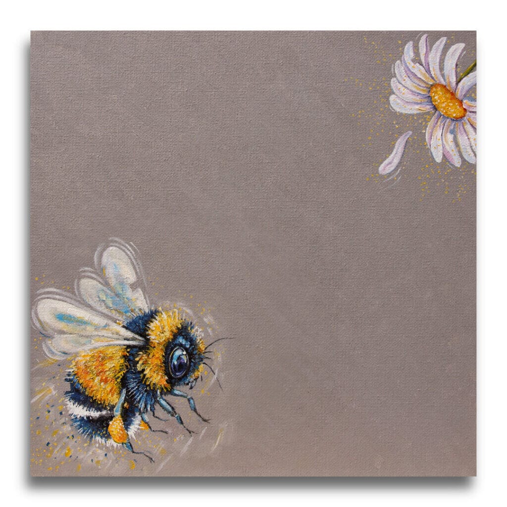
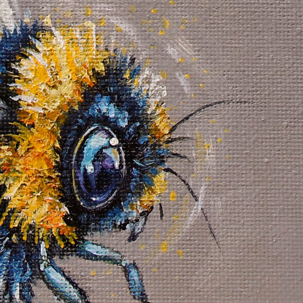
While we’re on the subject of taking lessons from Otherwurlde’s most popular subjects, then how about Moonflower?
A big, droning bumble bee just HAD to be in the collection, but how to do it? In the end, we had it aiming for an inviting moon daisy, laden with pollen. As before, Ann succeeded in adding a few motion lines around the wings and an intriguing reflection playing over its liquid eye.
And the background colour? ‘Stoke’ it is. Yes, we could’ve gone for any number of harmonious pastels, but we felt this particular grey brought out the bee’s bright colours to greater effect; looks most effective in a black frame…
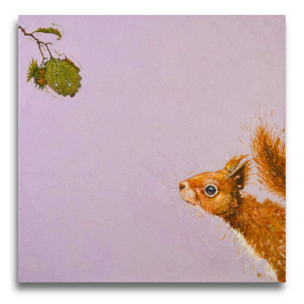
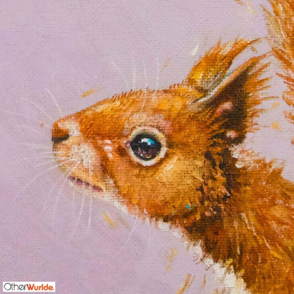
After a few weeks ‘out in the wild’, Ann & I now have a better idea of what’s working… Turns out, visitors to the Corn Hall really LOVE their squirrels, so it seemed a no-brainer to find something to complement ‘Feeling Nutty!‘.
Within every problem, it seems a solution hides in plain sight: do you agree? So it follows, that if ‘Feeling Nutty!’ is about the ecstasy of finally getting your paws on a prized nut, then it might be fun to backtrack a little to see a squirrel faced with the impossible! Ann & I have really laughed over this one, as we consider the wistful expression on the squirrel’s face…
‘Sugared Almond’ was the hue chosen for the background and we think it works so well here; indeed, it contrasts well with the ‘Chappell Green’ used before. There’s a meditative calmness about the piece that another shade just wouldn’t have given.
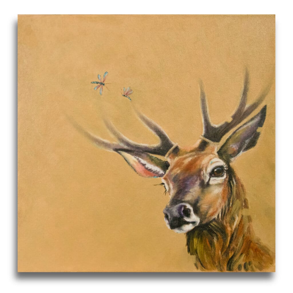
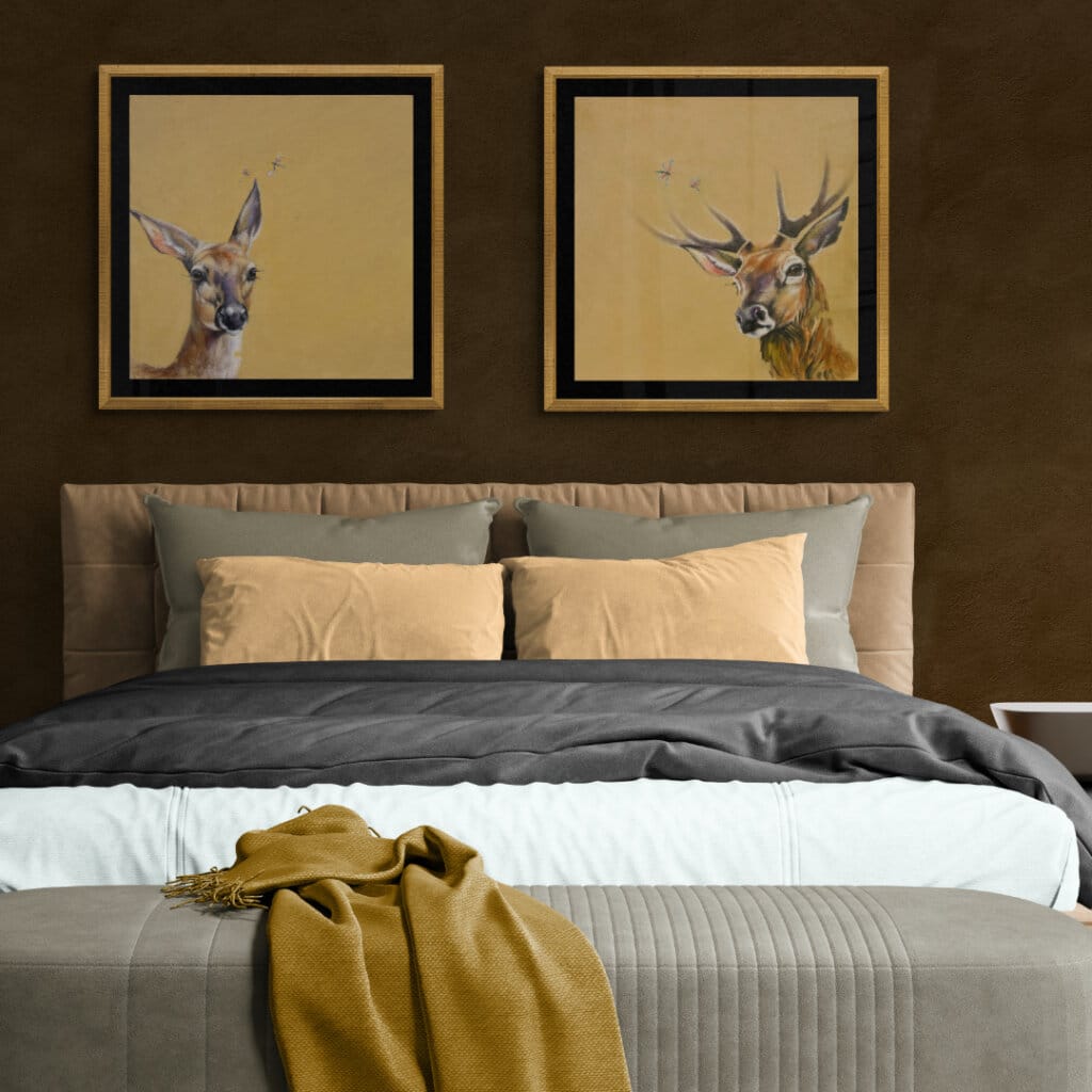
A surprise to both of us, has been the reception towards ‘There Be Dragons…‘
It seems that the red deer glimpsed from the roadside, across this part of northern Wiltshire, are held in great affection by many of you: the first painting has won more than its fair share of admirers… So it seemed only right, that we include a matching stag as part of this second half. Once again, the piece features a couple of ‘dragons’, but Ann was very pleased with the way they kiss the tips of antlers otherwise lost in the haze.
The background colour was always going to be the same for this one: ‘Orangery’. Together, this pair form a beautiful diptych with a complimentary eyeliner and tone.

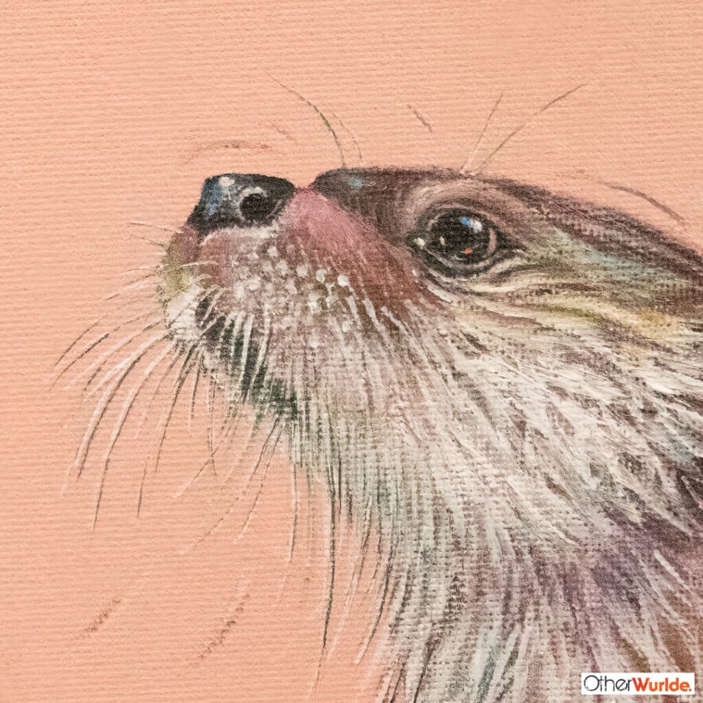
Another stand-out surprise to us, has been the reception for ‘Faster Food!‘. As with hares, foxes & deer, it seems that otters are a firm favourite in this part of the world so, once again, we felt compelled to find another pose.
This time, however, Ann wanted to strike a more contemplative tone for her second otter. This was helped by our adoption of B&F’s ‘Pink Cup’ as the background colour. This gentle, warm tone proved the ideal support for an otter carrying its own complement of warm mauves & dusky pinks, as it considers a dragonfly. The result? Fly Fishing emerges as a soul-stirring & mesmerising piece.
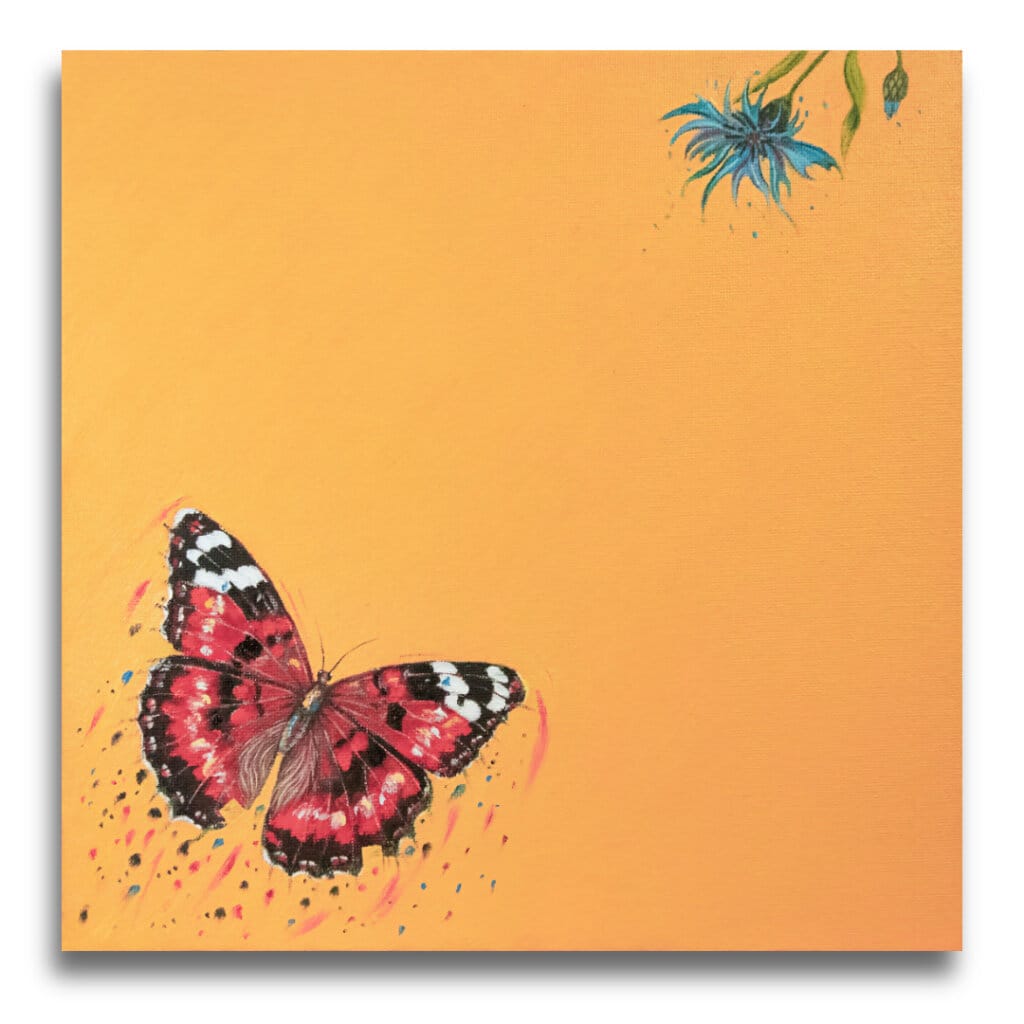
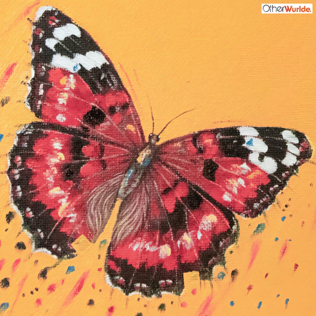
In complete contrast to the array of earthy pastels seen to this point, when it came to our first butterfly – a Red Admiral – we decided to go for broke and adopt this fantastic ‘Dutch Orange’ as our base.
If it does nothing else, it enlivens a space and provides a punchy contrast to the deep crimsons in the wings. One detail you might not have noticed? There’s a VERY subtle colour-shift across the background, that adds a darker, warmer shift to the blocking. It isn’t coming out terribly well on-screen, but it’s there.
And the title? It seemed to me, that the particles seen trailing behind the butterfly, could indicate it was flying at speed… It might be chasing something – perhaps another butterfly? Then I thought ‘The Admiral’s Fancy’ was the charm: Or is it just me!?

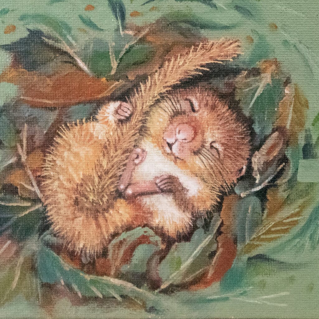
The fields around here, on the very edge of the Wiltshire Downs, support a wide variety of wildlife. Although we’ve never had the fortune of sporting a Dormouse ‘in the wild’, we’ve no reason to doubt that they’re out there. Never having painted one before, it was an easy decision for Ann to include one in this collection. Against a background of sage-like ‘Suffield Green’, we find the timeless ‘Sweet Dreams…’
This charming little dormouse is hibernating in its nest of leaves, as the wintery frost settles on the rosehip berries in the far corner. Ann’s particularly fond of how he’s clutching his tail & foot for reassurance during his sleep: much like a young child craving their favourite blanket…!
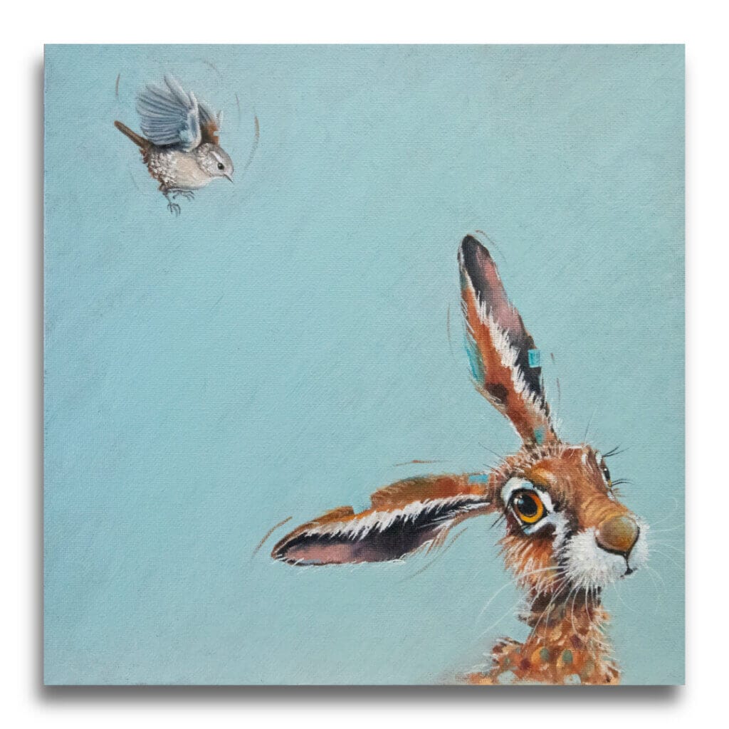
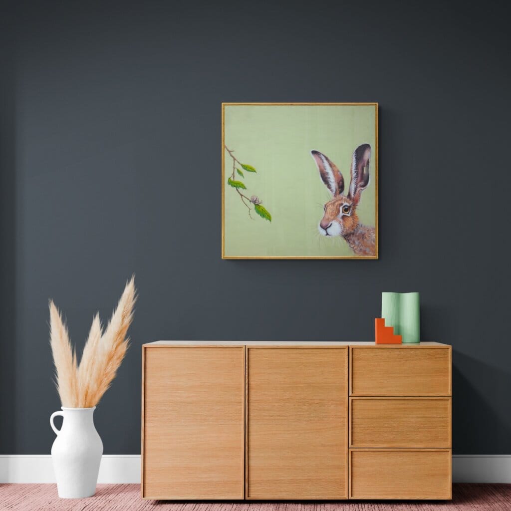
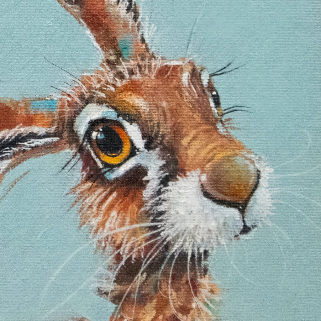
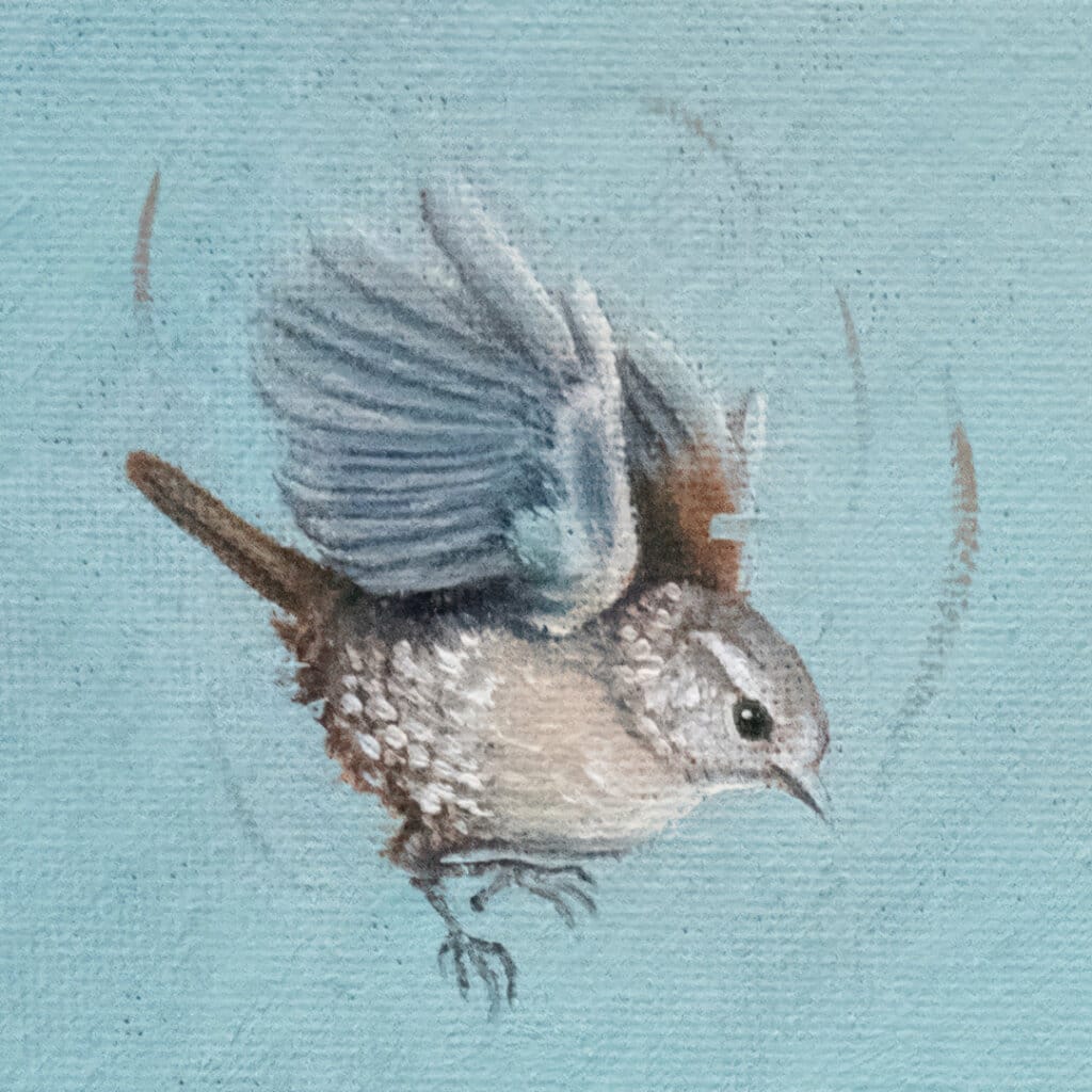
We already had a couple of hares. But… Ann felt compelled to deliver a trio of them, to fully ’round-out’ her vision. ‘Harey Landing!’ thus emerged, complete with its ‘Ancona Blue’ background; a painting that Ann now considers to be one of the most resolved & complete within the entire collection.
The air of determination in the wren – that sense of coming in to land regardless – always makes us laugh as we consider the hare’s reaction: little does he know what awaits him!
The collection’s first half, had a painting called ‘Feeling Nutty!‘, so when considering what we might call this one, there really was only one answer!
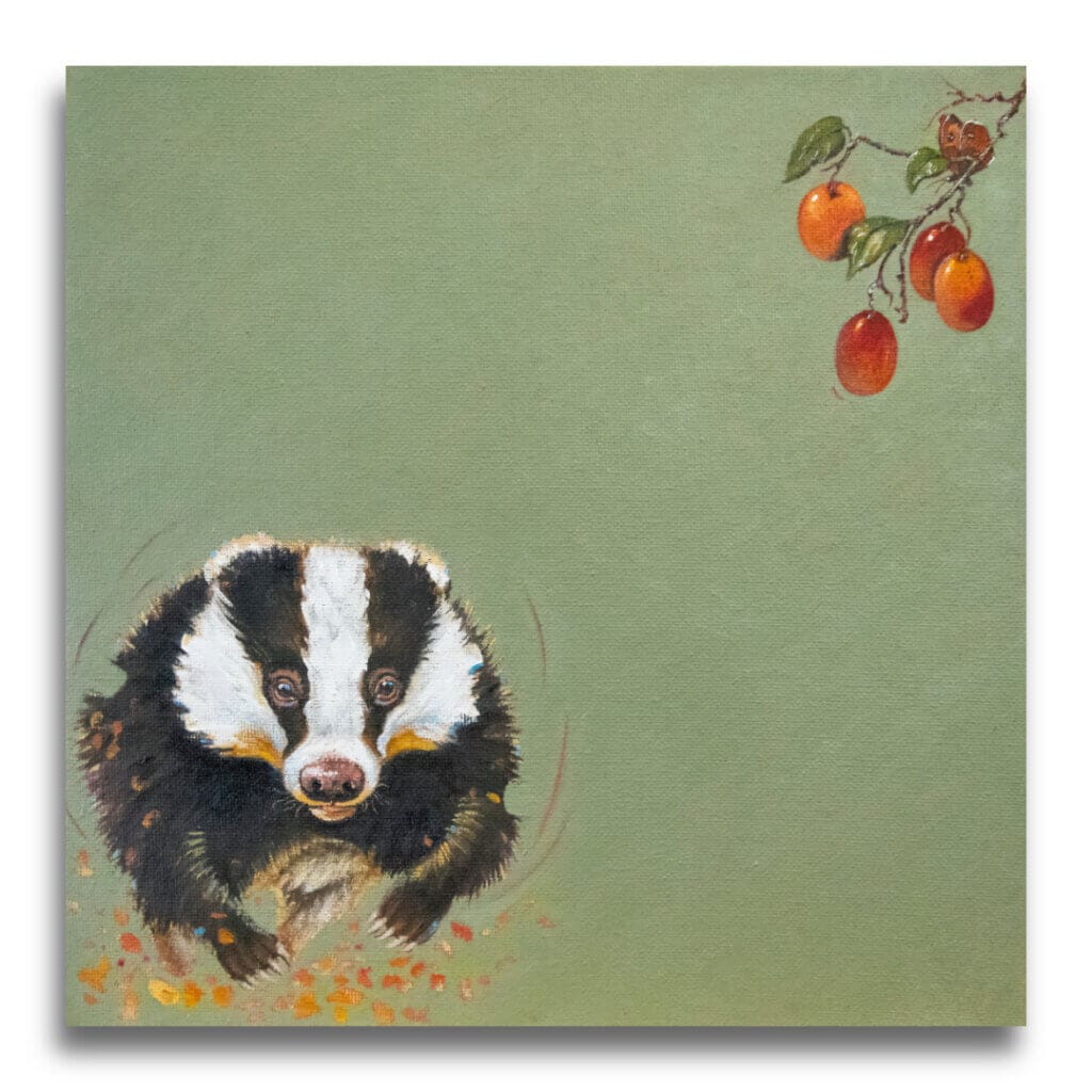
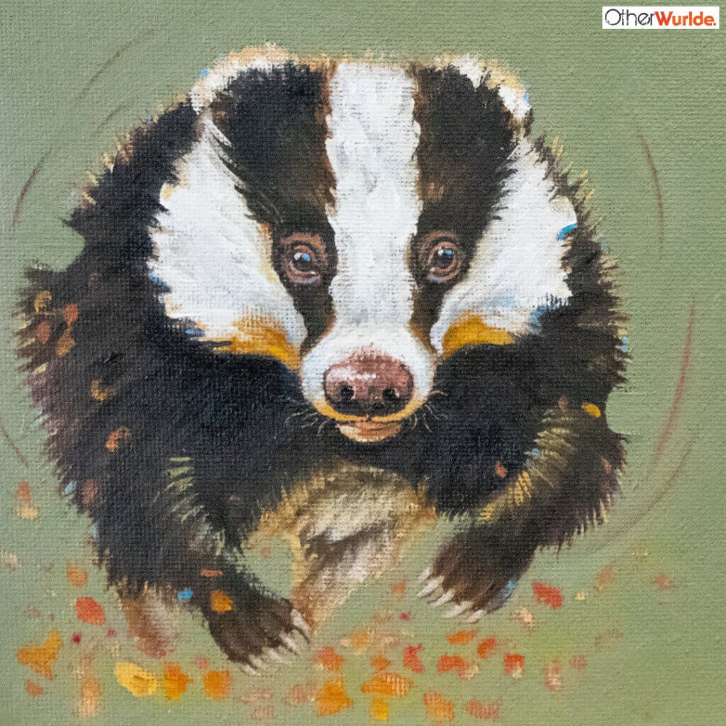
‘Berries For Badger‘ has been another surprise hit for us, so again, it only seems right to offer a pair of badgers. But we struggled with this one… Mostly how best to show the badger: what viewing angle should we show; what point-of-view?
Then I remembered seeing a short on Instagram some time ago, of someone out for a walk in a field being surprised by a female badger running up to them, full of curiosity. That unusual front-side-on view as it galloped (a little ungainly) towards the camera was so adorable, that’s what we chose. The subtle ‘Pea Green’ background was another firm win as far as the painting was concerned, along with the contrast it gives to the enticing bunch of Victoria plums in the top corner.
I also admire the suggestion of autumnal leaves being ‘kicked up’ as it runs. This subtle touch throws a gentle, warm light under the badger as it runs, giving warmth to the whole.
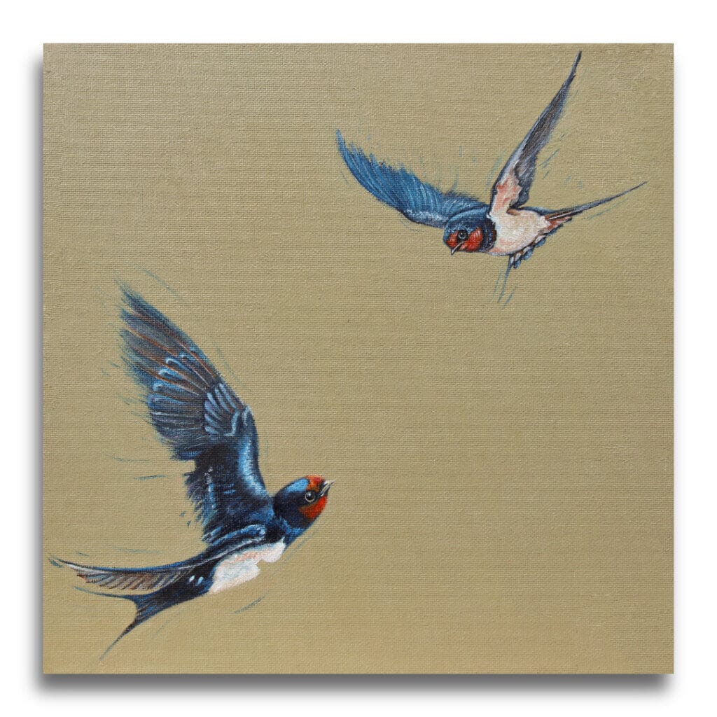
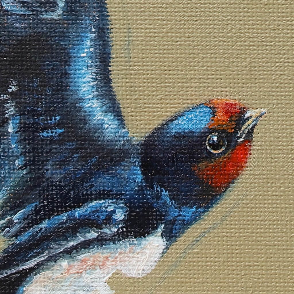
Right now, as I type this, I can look out of the office window and see a mixture of House Martins & Swallows as they catch flies dragged upwards in the warm air the UK is currently enjoying.
Right outside Ann’s studio window, we’re also blessed to have a nest or two, but this year the resident sparrows have resisted all efforts by the Martins to re-occupy their holiday home… Feeling a little sympathy with these magnificent birds, Ann painted this charming study, as a Swallow returns to a clutch of hungry chicks. For the background here, we went with ‘Stone White’; a hue that puts us in mind of the Downs: the magnificent rolling hills on our doorstep.
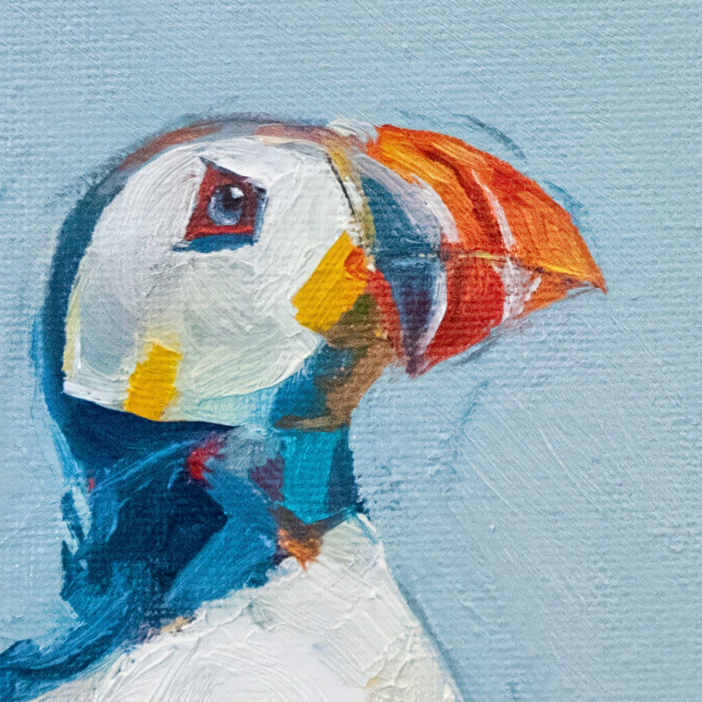
To round-off today’s ‘Back to the Wylde’, we present ‘Catch of the Day…’!
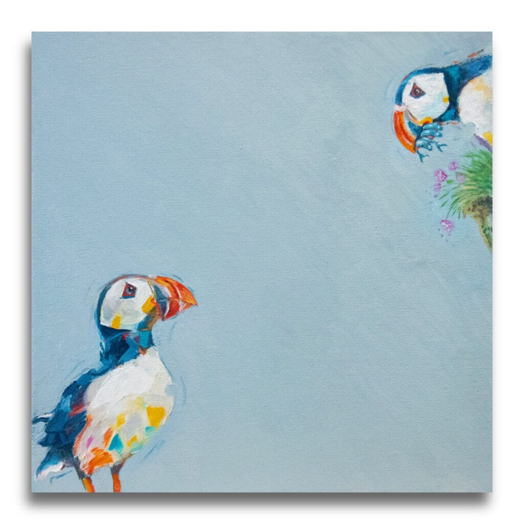
From the very beginning, right back when we were planning this collection, we knew that it somehow wouldn’t be complete without puffins! The thing is, neither of us can explain WHY! It’s been more of a feeling, really…
As it turns-out, we couldn’t be happier with ‘Catch’, as Ann painted it with more gusto – more oomph! – than others in the collection. Laying-on the paint in thicker strokes – ‘impasto’ – doubles down on the Puffin’s bold colours, and somehow makes it more impactful against the ‘Hazy’ blue background.
Certainly, the expectant – hopeful – look on the face of the main bird as its mate approaches with food, is similar to the feeling I get when Ann mentions the prospect of biccies with my tea!
The image below, shows how we’re framing Original Artworks for this collection. We’re having work float-mounted over a matte background of midnight blue. There’s then a small gap before we get to a fillet of distressed & antique’d effect brass. That allows the blue backboard to show through along with the natural shadows cast by the artwork itself. It’s a beautiful solution. As for the actual moulding, we’re using a gently contoured, inward-sloping moulding in matte-black. We consider this the ideal solution to best support these expressive slabs of colour and allow them to ‘sing’.
Whenever I’ve mentioned the Open Studios before, it’s always to remind you that we’ll be missing from the Corn Hall throughout July.
This year however, the acquisition of a 2nd card reader (duh!) has given us the opportunity of being in both places… So, I shall be at the Corn Hall for every weekend as usual, but showing ONLY The Wylde Ones… Meanwhile, Ann will be holding the fort back here at HQ, with an emphasis on Otherwurlde. Indeed, there’s every chance she’ll still be working on the work you can see a sneak-peak of below.
I say this every time: Our stand at the Corn Hall might look impressive these days, but we still struggle for storage. That means we can’t bring everything you might want to see…
Neither Ann nor myself want to disappoint you, so if there’s anything you’d particularly like to see in-person, PLEASE get in-touch ahead of time and we’ll ensure it’s there!
Thanks for getting to the end of this Newsletter!
Well there we are: The Wylde Ones‘s second wave are out-and-about!
It’s been a long while since we tackled a ‘straightforward’ wildlife project and the scale of this one has been daunting at-times, but the reaction has been overwhelmingly positive. Now that everything’s been revealed, we hope that you’re as thrilled by these as we are…
As I’ve said here numerous times – and again, to many of you in-person in Cirencester – the arrival of ‘The Wylde Ones’ merely allows us to produce the work that so many of you love. It’s the battery that will keep the Otherwurlde light shining!
I think we’re going to end up alternating releases between the two collections, so whichever you’re drawn to, I’d ask that you ‘keep the faith’. Lastly, I can’t close without offering our thanks to you all. Your support (and patience) has been immense over the few years we’ve been on this ride together; we couldn’t do this without you: let’s keep this light shining!